Apple taught me everything
I was incredibly lucky to have spent my first nine years in tech at Apple. I began as an entry-level production artist in Apple’s Creative Services department and left as a senior MacOS product manager for printing, type, and graphics. Apple gave me the core skill set I rely on to this day in all my work.
Graphic and visual design: Apple has always been renowned for its design esthetic. I was hired as an entry-level graphic designer and have embraced Apple’s principles of simplicity and clarity in my product design work.
Clear and compelling writing: From daily emails and presentations to technical specs and marketing materials, I always write as if I were still writing for Apple. That includes the use of Oxford comma ▸.
Technical knowledge and curiosity: I was directly responsible for formally introducing the Macintosh into Creative Services’ production processes and working with alpha- and beta-versions of industry-defining applications such as Aldus Pagemaker, Adobe Illustrator, and Quark Press and equally important hardware such as the Apple Laserwriter, the Fiery printer server, and the first color and high-res displays.
Product management: I was asked to join the MacOS team and write requirements for and publicly launch critical OS-level printing, typographic, and graphics features.
Product marketing: All Apple product managers were responsible for crafting product launch strategies and messages. In support of that effort, Apple sent the entire MacOS product management team to 40 hours of press and media training, perhaps the most valuable work perk I have ever received.
Apple’s first (known) remote worker: I moved to Boston in 1989 for personal reasons. When I gave notice, my manager and the Director of Creative Services asked if I would be willing to work remotely. Using a 9.6K baud modem, Apple’s rudimentary in-house email system, CD-ROMs shipped via FedEx, and conference call technology I worked the next three years from Beantown.
Apple was never boring. With new skills came plenty of new job opportunities.
Production artist: My first job at Apple involved manually pasting together layouts for brochures, packaging, and posters. Because of my experience with the Macintosh (a rare skill at the time), I quickly shifted to doing the majority of my work digitally.
Graphic designer: I became personally responsible for the layout and content printed materials and nascent digital media such as presentations, interactive Hypercard decks, and early QuickTime video.
Copywriter: As a graphic designer I often wrote my own copy due to the technical complexity of the subject matter. Turned out my writing skills were considered more important than my design skills.
MacOS Product manager: I was the technical liaison between Creative Services and Apple’s hardware and software development teams. I was asked to join the MacOS product management team to bring QuickDraw GX, Apple’s core printing, type, and graphics technology, to market as part of the System 7 launch.
What follows are just a few highlights of my Apple career.
First interactive annual report
First digitally-produced annual report
Annual reports were always a big deal in Creative Services, commanding large budgets and the best designers and writers in the department. Because of their visibility within the influential investing community, every annual report provided a great opportunity to showcase recent advances in Apple technology.
1987: First interactive annual report
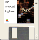
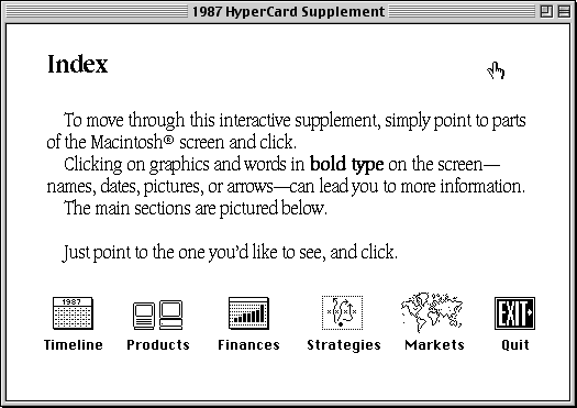
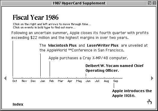
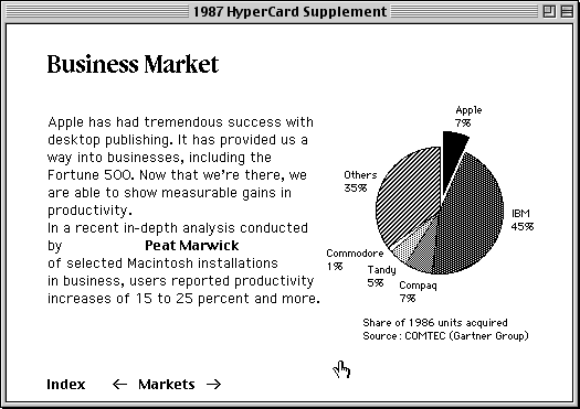
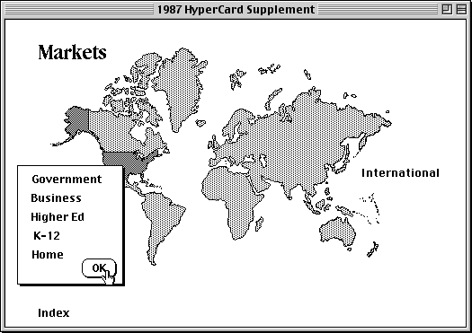
HyperCard ▸, an application for creating interactive content “decks,” was introduced in 1987. In those pre-internet, pre-HTML days it wasn’t clear what you could actually use HyperCard for. But Creative Services was fascinated by HyperCard. A few creative directors realized they could use HyperCard to showcase the content of the upcoming 1987 annual report in an entirely new way.
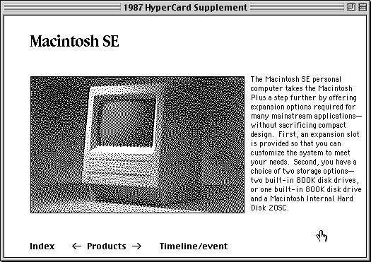
I was a member of the team that put together the deck. It was an amazing experience. We had to decide, from scratch, on interactions and navigation paradigms users take for granted now. For example, how do you identify click-able items to someone who’s never clicked through interactive content before? What animations are needed to convey how the user is navigating content? And how do you display rich graphics when your color choices are limited to black or white?
The Apple annual report HyperCard supplement was sent on disk to a limited number of shareholders and analysts. The idea was to encourage people who didn’t have a Mac to find one in order to view the content.
1988: First annual report digitally-produced 100% on a Mac
By 1988, designers in Creative Services had become skilled at using Mac-based page layout software to set and output type and graphics which would then be pasted-up using traditional, manual production methods. I proposed that we produce the 1988 annual report entirely on a Mac—I’d lay out the report, hit the Print button, and the necessary film negatives would come out of the department’s high-resolution Linotype printer. The film negatives would then be used to create the printing plates—no manual production would be required.
There were a lot of interesting, potentially project-blocking problems: we didn’t have a digital version of Apple’s Garamond Condensed typeface with a sufficient number of fractional characters needed for financial data and charts; the resulting document file size pushed the then top-of-the-line Mac’s computing power to the limit; and I became a workflow bottleneck as digital production couldn’t be shared across multiple operators.
Initial deadlines were missed. Finally, on the last possible day, at the last possible moment, as the last available courier was leaving the Creative Services’ building at 10 pm because they had to get to the airport in time to deliver their other clients’ packages, I ran out into the parking lot with the negatives and handed them off.
Subsequent years went much more smoothly.
First digitally-produced full-color print job
1989: Seybold conference hand-outs
I learned a lot from the 1988 digitally-produced annual report effort. But the resulting document was glossy, high-end—and black-and-white. For the Seybold printing conference, I wanted to produce a full-color print piece. This would require output software that could take color graphics data, separate it into cyan, magenta, yellow, and black layers, and then print each layer as a high-quality negative. This is common practice now, but hadn’t been done commercially before.
Lightspeed, a British-based maker of high-end commercial scanners, agreed to work with me on this project. I wrote and designed a brochure showcasing the range of Macintosh media. Attempts to print negatives in California weren’t successful (temperature differences caused the film stock to expand or shrink slightly, creating negative sets that didn’t precisely align with one another). The final four-color film was output at Lightspeed’s offices in London, hand-carried to New York on the Concorde, and then by commercial airline to California.
The introduction of TrueType
1991: Great type onscreen
There was a time when the introduction of resolution-independent type technology was considered a game-changer in the person computer market. TrueType was not only critical to the type design market, but had a key benefit for users—it allowed type of any size to be displayed clearly and accurately on-screen. Even non-designers appreciated the difference that made in the appearance of text in word processors and spreadsheets.
I wrote, designed, and produced this brochure entirely on my own while working remotely in Boston for Apple.

