Senior HIO Design Engineer
Human Interface Team
7/1999 - 4/2004
I was a founding member and manager in the Palm Human Interface (HI) team, responsible for the UX and look & feel of consumer applications (Palm Zire 71 camera, voice memo, and dialer), desktop clients, utilities, and on-device product tours. I also directed the implementation of color and high-resolution graphics and fonts in the Palm OS.
Designed UX and look & feel of consumer applications (Palm Zire 71 camera, voice memo, and dialer), desktop clients, utilities, and on-device product tours.
Directed the implementation of color and high-resolution graphics and fonts in the Palm OS.
Managed designers, user researchers, and technical writers.
Palm Zire 71
The Zire 71 was Palm’s first handheld with a built-in camera. To use the camera, a Zire user would slide the device open to reveal the camera lens and a hardware shutter button. A new Camera application would control the camera hardware. Pictures would be stored in an updated version of the existing Palm Photos app.
As spec'ed, the original Zire 71 camera UX would have been very difficult to use due a lack of integration between hardware and software.
For example, the user could open the Camera app without having first opened the handheld. But the lens would still be covered and the Camera app screen would be black.
Conversely, the user could open the handheld and uncover the lens first. But the current app would still be active and the user would have to manually open the Camera app.
After taking pictures, things got even more complicated. Storage on the Zire 71 and compatible SD cards was extremely limited—especially in comparison to modern hardware—and the user had to manage photos carefully. The user would have to manually copy pictures from the Camera app to the Photos app and then delete the same pictures from the Camera app.
Of course, there was no time to do things the right way and create a single, integrated Camera/Photos app.
A sneaky UX solution and a CHI case study ▸
I solved the UX problem with a little smoke and mirrors.
The user never saw a separate Camera app—it existed, but its icon was hidden on the Palm OS app screen. The Camera app launched automatically when the user opened the Zire 71 handheld. The user took pictures and, when the handheld was closed, the pictures were automatically moved to the Photos app and deleted from the Camera app. The Photos app then opened automatically, displaying a screen identical to the thumbnail view in the Camera app. In all, an app was opened, data was captured, copied, and duplicates deleted; the first app was closed, a second app opened, and the same data was displayed. To the user this appeared to be a single, unified interaction experience.
My use case was selected for presentation at the worldwide CHI meeting in Vienna the next year. In the intro I wrote:
This case study shows the evolution of a camera interface […] Discovery was minimal, user testing nonexistent, and there are no published results. In other words, this case study describes how an elegant human interface design gets created under real (i.e. unreasonable) deadlines and with typical (i.e. nonexistent) resources.
One reviewer rejected it because, “it had nothing to teach my students.” Other reviewers countered saying, in effect, that this was a true, real-world example and it was important for students to understand that the design process rarely works the way it’s supposed to.
Palm OS enhancements
During my time at Palm, hardware and software graphics support was updated significantly, from 1-bit, 72 dpi, 160x160 pixel displays to 8-bit color and 320x320 pixel displays. The entire OS required a thorough look-and-feel redesign.
Palm OS color support
I designed the color scheme for the Palm OS in support of the launch of the Palm IIIc. The final scheme took legibility, branding, and notification into account. I was lucky to be able to hire Susan Kare of Macintosh fame to do the updated color icons.
Palm OS high-res support
I was responsible for redesigning the typefaces for the new, high-res handsets. I worked with the Dubberly Design Office to create literally thousands of character variations.
Palm OS dialer
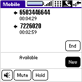
Before Palm acquired Treo, it intended to make its own phones. I designed the dialer. My goal was to make setting up conference calls so easy that no one would ever again say, “If I drop you...” User-testing of a fully-interactive prototype yielded success rates in the high 80% range.
And this was designed four years before the iPhone introduced visual call management to the consumer market.
Product design or make-believe?
This project was equal amounts thrilling and frustrating. On one hand, I had developed an interaction which made a very complex process—setting up and managing conference calls—virtually fool-proof. Usability success rates were through the roof and testers would say things such as, “I’d buy this right now for my entire company if it were available!” I reported my results to the development team only to find out that cellular networks at the time were unable to support the kind of call management I had designed.
I learned then that one of the benefits—and risks—of being a product designer is that your development environment is basically a graphics app. And that just because you can design it doesn’t mean you can build it.
Palm OS tours, installers, and setup
Palm devices were easy to use—once you had them set up properly. I designed multiple installation and configuration sequences for both handsets and desktop computers, experiences I still draw on when designing account creation and log in sequences today.


